
A tornado diagram earns its place in supply chain risk management because it forces a messy workshop into a ranked conversation. Instead of treating supplier disruption, lead-time variability, demand volatility, commodity-price shocks, and transportation cost as equally alarming, the chart asks a narrower question: if one input moves while the others stay fixed, which variable moves the target KPI the most?
That discipline still matters. A classic tornado diagram ranks input variables by the magnitude of their effect on an output such as expected profit, service level, inventory cost, or mean flow time; it is commonly used as a one-way sensitivity analysis tool, with the widest bar at the top and smaller effects descending below it.[1][2] For an executive meeting, that visual ranking is useful. For the analyst who has to defend the ranking afterward, it is only as strong as the assumptions that produced the bars.
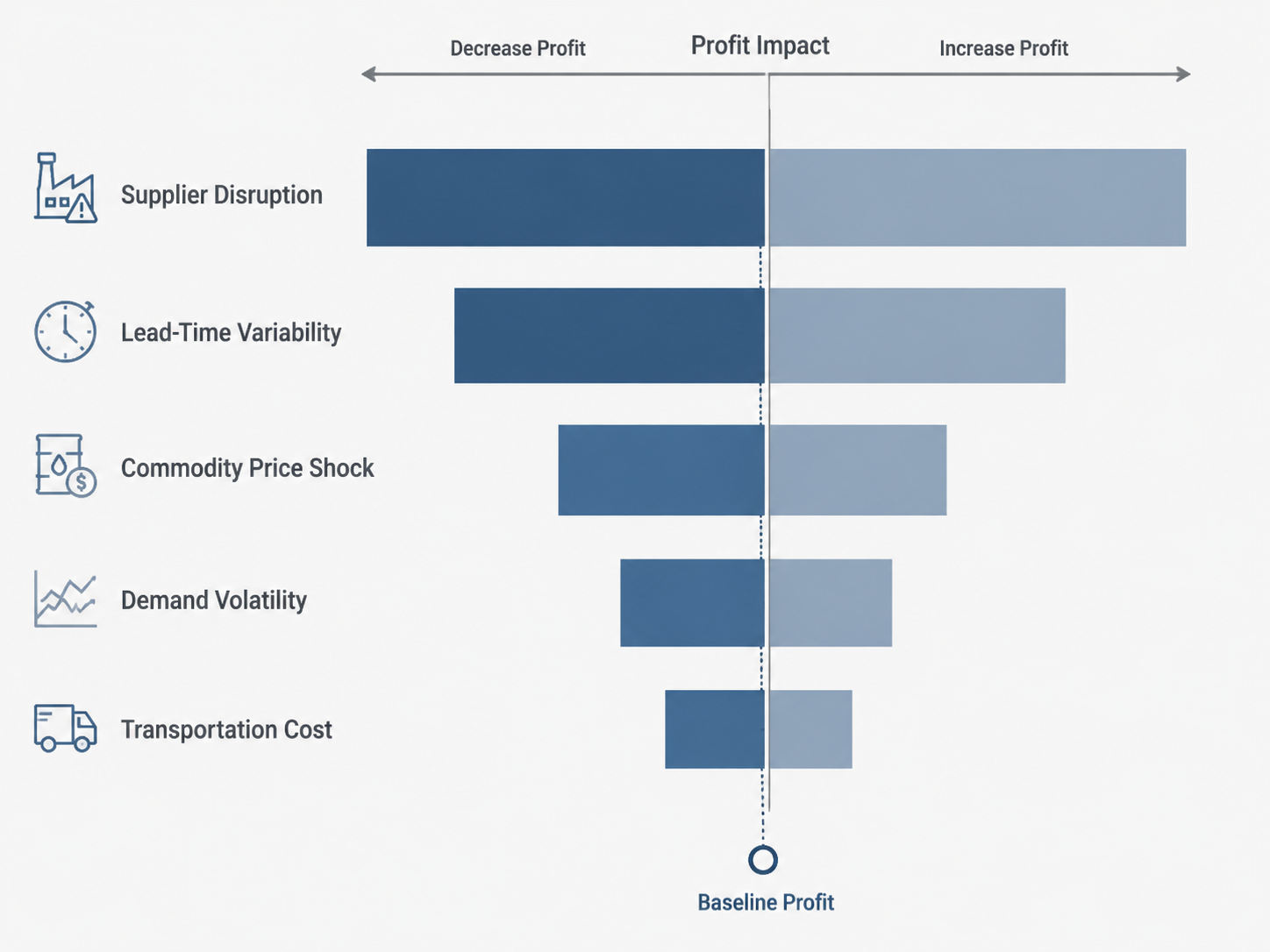
That is where AI-enhanced tornado workflows for supply chain risk management become worth examining. The useful shift is not that a machine draws a nicer chart. It is that machine learning models, historical disruption data, market feeds, weather signals, and simulation engines can change what feeds the chart, how often the ranking refreshes, and how clearly the team can explain why a risk moved up or down.
The business pressure is real enough to justify better machinery. Everstream, citing McKinsey, frames supply chain disruptions as costing companies 45% of one year’s profits over a decade, and reports that AI-driven, risk-optimized procurement can reduce revenue losses from disruptions by 30%.[3] Those figures do not prove that an AI-enhanced tornado diagram will outperform a spreadsheet in every environment. They do explain why procurement and risk teams are being asked to quantify disruption exposure with less tolerance for guesswork.
What the Traditional Chart Gets Right
The traditional tornado diagram is not an immature tool. It became popular because it gives a clean answer to a common decision problem: which assumption deserves scrutiny first? In a supply chain model, that assumption might be supplier recovery time, port delay duration, forecast error, commodity price movement, production yield, expedited freight cost, or safety-stock policy.
The method is especially useful when the team has a defined KPI. If the KPI is expected gross margin, a tornado chart can show whether supplier failure matters more than a copper-price swing. If the KPI is mean flow time, it can show whether variability in one processing step deserves more attention than variability in another. The chart does not settle the procurement strategy by itself; it tells the team where a wrong assumption would hurt most.
Manufacturing and supply chain examples already exist without needing an AI label. Lumivero describes how Novelis, an aluminum recycler, used @RISK sensitivity analysis to generate tornado charts that ranked technical risk factors in aluminum recycling process changes.[4] SAS published a semiconductor fab analysis using OPTMODEL, NLMIXED, and REG procedures to develop local sensitivity measures for how changes in the mean and standard deviation of processing times affect mean flow time, with the results visualized in tornado plots.[5]
Those cases matter because they keep the discussion grounded. Tornado-style sensitivity analysis already has credibility in process decisions, flow-time risk, and supply chain modeling. AI does not need to rescue the chart from irrelevance. It needs to improve the weak parts: manual ranges, stale assumptions, limited scenario coverage, and rankings that can become obsolete as soon as supplier performance or external conditions change.
Where the Spreadsheet Version Starts to Strain
A spreadsheet tornado chart usually begins with a base case and a set of high-low assumptions. The analyst varies one input at a time, records the impact on the KPI, and sorts the bars by impact magnitude. That process is transparent, fast, and easy to present. It is also easy to overtrust.
| Traditional tornado question | Practical limitation in supply chain risk |
|---|---|
| What happens if supplier recovery time increases? | The high-low range may be manually estimated from a small set of incidents. |
| What happens if demand volatility rises? | The chart may not capture correlation with promotions, macro signals, or customer mix. |
| What happens if lead time shifts? | One-way testing can miss combined effects with inventory policy and transport constraints. |
| What happens if commodity prices move? | A static range may age quickly when market conditions change. |
The methodological boundary is important: a classic tornado diagram varies one variable at a time. Monte Carlo simulation samples from probability distributions across many iterations. Machine learning may estimate those distributions, classify disruption risk, or detect changing patterns in supplier, weather, logistics, and market data. These are related capabilities, but they are not the same technique.
Conflating them creates bad procurement governance. If a dashboard claims to show an AI tornado ranking, the first question is not whether the bars animate. It is whether the ranking came from one-way deterministic sensitivity, Monte Carlo simulation, ML-generated scenarios, or some hybrid of those methods. Each answer implies a different burden of validation.
The Workflow Shift: From Manual Ranges to Probabilistic Risk Ranking
The strongest AI-enhanced workflow does not begin with the chart. It begins with the risk model behind the chart. A defensible process typically moves through five activities, although not every organization automates all of them at once.
- Define the decision KPI: profit, service level, working capital, mean flow time, recovery cost, or another measurable outcome.
- Identify risk drivers: supplier disruption, demand volatility, lead-time variability, commodity shocks, logistics delays, production constraints, or weather exposure.
- Estimate ranges or probability distributions from historical and external data rather than relying only on workshop estimates.
- Run deterministic sensitivity analysis, Monte Carlo simulation, or both, depending on the decision question.
- Rank the drivers visually, then review the assumptions, data lineage, and model behavior behind the ranking.
In the old workflow, an analyst might type a 10-day and 30-day recovery range for a supplier because that was the consensus in the room. In an AI-enhanced workflow, the recovery-time distribution may be informed by supplier performance history, previous disruption duration, shipment data, facility exposure, and external signals. The tornado chart can still be the presentation layer, but the input is no longer just a negotiated assumption.
Resilinc’s hurricane simulation model is a useful example of this change in inputs. The company describes using regression, classification, and simulation models for supply chain risk, with a Hurricane Simulation Model that supports tornado-style what-if analysis on natural-disaster impacts.[6] That does not mean every weather-exposed supplier risk can be fully automated. It does show how a model can convert external hazard signals and supply chain exposure into a structured sensitivity workflow.
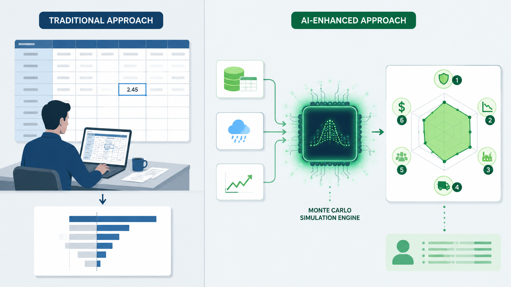
Monte Carlo simulation changes a different part of the workflow. Instead of asking what happens at one high and one low value, the model repeatedly samples combinations of inputs from defined distributions. A SupplyChainBrain example using Palisade technology describes a tornado chart across 10,000 Monte Carlo iterations in which supplier failure emerged as the highest-impact variable on expected profit.[7] That is a much more useful procurement conversation than a flat list of risks labeled high, medium, and low.
The distinction is not academic. If supplier failure ranks highest in a one-way chart, the team has learned that expected profit is highly sensitive to that assumption when isolated. If supplier failure ranks highest after many simulation iterations, the team has evidence that the variable matters across a modeled uncertainty space. The second result may be more operationally persuasive, but only if the probability distributions and correlations are defensible.
What AI Actually Adds
AI is most useful when it improves the risk inputs, scenario coverage, or refresh cadence. It is least useful when it simply renames a sensitivity chart. In supply chain risk quantification, the credible additions fall into a few practical areas.
| Capability | What changes in the tornado workflow | What to verify |
|---|---|---|
| ML-informed distributions | Supplier recovery time, lead-time variability, or demand volatility can be estimated from observed patterns instead of only manual ranges. | Training data quality, feature relevance, drift monitoring, and explainability. |
| External signal ingestion | Weather, market, logistics, and disruption signals can update scenario assumptions more frequently. | Signal latency, false positives, supplier mapping accuracy, and source reliability. |
| Monte Carlo integration | The ranking can reflect thousands of simulated outcomes rather than a small set of high-low cases. | Distribution choices, correlations, iteration count, and reproducibility. |
| Dynamic ranking | Risk drivers can move as supplier performance, demand conditions, or market inputs change. | Version control, audit trails, threshold logic, and human review points. |
| Decision workflow connection | The ranked risks can feed mitigation planning, sourcing decisions, or a broader control tower workflow. | Separation between analysis, recommendation, and automated action. |
The first addition, ML-informed distributions, is often the most valuable and the easiest to misunderstand. A model that learns from late shipments, quality escapes, missed acknowledgments, past disaster exposure, or market volatility can help estimate more realistic input behavior. But adoption of ML does not automatically establish effectiveness. The team still has to show that the model is trained on relevant data, monitored after deployment, and recalibrated when supplier behavior or market structure changes.
The second addition is refresh cadence. A quarterly spreadsheet exercise may be enough for slow-moving cost assumptions. It is less suitable for weather-driven disruption exposure, constrained logistics networks, or supplier distress indicators that can change weekly or daily. AI-enabled inputs make more sense when the underlying risk is dynamic enough to justify frequent refreshes.
The third addition is scenario breadth. Monte Carlo capabilities in tools such as @RISK/Lumivero and SAP IBP can support probabilistic simulation, while SAS procedures can support rigorous sensitivity analysis in complex manufacturing contexts.[4][5] Platforms such as Resilinc focus on AI-based risk modeling, and PlanetTogether describes machine learning for predicting supply chain disruptions in manufacturing planning contexts.[6][8] These references should be treated as capability examples, not proof that all products implement the same statistical method or deliver the same decision quality.
For teams building broader monitoring architecture, tornado analysis may become one layer inside a control tower rather than a standalone artifact. A ranked sensitivity view can help decide which alerts deserve escalation, which suppliers need contingency planning, and which assumptions should be retested. That connection is useful, but it should not erase the boundary between risk visualization and automated decisioning. For more context on the platform layer, see this explanation of the supply chain control tower AI capability spectrum.
How to Read an AI-Enhanced Tornado Ranking
A good tornado ranking tells the team where the KPI is most exposed. A poor one tells the team where the model is most confident in its own assumptions. The difference usually appears in the review questions.
Start with the KPI before debating the model
Supplier failure may rank first for expected profit and lower for service level if alternate inventory is available. Lead-time variability may dominate working capital but matter less to short-term revenue if customers tolerate longer delivery windows. Commodity shocks may overwhelm margin while leaving fill rate unchanged. The KPI determines what impact means.
This is also where supply chain teams should resist overgeneralized dashboards. A single enterprise risk score may help triage attention, but a tornado chart should stay tied to a decision. If the decision is whether to dual-source a component, the relevant output may be expected profit or recovery cost. If the decision is whether to increase buffer inventory, the relevant output may be service level, working capital, or expediting exposure.
Separate one-way sensitivity from simulation output
A tornado chart produced from one-way sensitivity analysis has a different interpretation from a tornado-style chart produced after Monte Carlo simulation. The first isolates each variable. The second may summarize contribution to output variance or rank drivers across simulated outcomes, depending on the implementation. Both can be valid. They should not be described as interchangeable.
That distinction affects the mitigation conversation. A one-way result may tell the team to refine the supplier recovery assumption. A simulation result may tell the team to examine supplier failure probability, recovery duration, inventory policy, and demand conditions together. If the chart does not explain which method produced the ranking, it is not ready for a sourcing decision.
Look for changing bars, not just changing colors
Dynamic risk analysis should produce substantive ranking changes when inputs change. If a supplier’s late shipments increase, a port becomes constrained, a storm path shifts, or a commodity market changes, the model should expose whether the expected impact on the KPI has changed. A static dashboard with refreshed labels does not create dynamic risk quantification.
This is where AI disruption-planning capabilities need to be mapped to the actual risk driver. Weather classification may help with hurricane exposure. Time-series forecasting may help with demand volatility. Graph-based models may help where multi-tier supplier relationships matter. The technique should follow the risk structure, not the other way around. For a deeper technical path, see this discussion of graph neural networks for supply chain disruption prediction.
A Practical Evaluation Checklist
When a vendor or internal analytics team presents an AI-enhanced tornado workflow, the evaluation should be less about whether it uses AI and more about whether the ranking can survive challenge. The following checks are usually more useful than a feature tour.
- Assumption transparency: The tool should show the baseline, input ranges, distributions, correlation assumptions, and the KPI formula or simulation logic behind the bars.
- Historical data quality: Supplier performance records, lead-time history, disruption logs, demand data, and cost inputs should be complete enough to support the claimed model behavior.
- Probabilistic modeling capability: If the workflow claims to be simulation-based, it should explain the distributions, iteration logic, output metrics, and reproducibility controls.
- Model-monitoring discipline: The team should track drift, prediction error, false positives, false negatives, and changes in supplier or market conditions.
- Method separation: The interface should distinguish visualization, deterministic sensitivity analysis, Monte Carlo simulation, ML prediction, optimization, and automated action.
- Governance fit: Procurement, planning, finance, and risk owners should know who reviews ranking changes and who can approve mitigation actions.
The last point is often where technically strong pilots weaken. A dynamic risk ranking is not automatically a decision right. If the top bar shifts from commodity price shock to supplier disruption, someone still has to decide whether to expedite inventory, qualify an alternate supplier, renegotiate terms, or accept the risk. Automated recommendations can be useful, but automation is not automatically more mature than review.
Gartner predicts that 60% of supply chain disruptions will be resolved without human intervention by 2031, driven by AI-enabled autonomous supply chains.[9] That is relevant context for where risk operations may be heading. It is not direct evidence that tornado diagrams themselves are becoming autonomous decision engines. The safer interpretation is that sensitivity rankings will increasingly feed automated or semi-automated response workflows, especially where the assumptions, thresholds, and decision rules are well governed.
Where Adoption Makes Sense First
AI-enhanced tornado analysis is most valuable where risk drivers are measurable, volatile, and decision-relevant. Supplier disruption risk is a natural candidate because historical performance, financial distress indicators, facility exposure, logistics dependencies, and incident data can all affect the probability and consequence of failure. Demand volatility is another, especially when forecast error interacts with service-level commitments or constrained inventory.
Lead-time variability also fits the method well because it often has a measurable history and direct consequences for working capital, production schedules, and expediting cost. Commodity-price shocks can fit when the team has clear exposure, contract terms, and margin sensitivity. Natural-disaster exposure may require more specialized external signals and geospatial supplier mapping; it should connect to preparedness and recovery planning rather than sit as a decorative risk score. For a related view of prevention, preparedness, response, and recovery work, see this guide to AI for supply chain disaster recovery.
Adoption is weaker where the data is thin, the KPI is vague, or the organization wants the chart to settle a policy disagreement that the model cannot answer. A tornado diagram can show that expected profit is highly sensitive to supplier failure. It cannot decide by itself whether the company should pay a premium for dual sourcing, hold more inventory, redesign the product, or accept a lower service level. That judgment still belongs to the business.
The Adoption Judgment
AI does not make tornado diagrams obsolete. It changes the quality of the inputs, the scale of the scenarios, the refresh rate of the ranking, and the audit trail behind a supply chain risk conversation. The chart remains valuable because people still need a ranked view of what moves profit, service, cost, or flow time. The old limitation was never the shape of the chart; it was the fragility of the assumptions behind it.
Teams evaluating AI-enhanced tornado workflows for supply chain risk management should look for transparent assumptions, strong historical data, probabilistic modeling capability, model-monitoring discipline, and a clear separation between visualization, simulation, machine-learning prediction, and automated decisioning. If those pieces are present, the tornado diagram becomes more than a meeting graphic. It becomes a defensible way to rank which supply chain risks deserve action first.
References
- Tornado Diagrams 101. Planview. 2012.
- What is Sensitivity Analysis? Evaluating Risk and Uncertainty. Quadratic. 2025.
- How AI transforms supplier risk management. Everstream Analytics. 2025.
- Optimizing Manufacturing Operations with Monte Carlo Simulation. Lumivero. 2023.
- Risk driver analysis for complex supply chains. SAS. 2022.
- 5 Models of AI for Supply Chain Risk Management. Resilinc. 2024.
- Monte Carlo Simulation Means Quantifying Logistics Risks Doesn't Have to Be a Gamble. SupplyChainBrain.
- Machine Learning for Predicting Supply Chain Disruptions. PlanetTogether. 2025.
- Gartner Predicts 60% of Supply Chain Disruptions Will Be Resolved Without Human Intervention by 2031. Gartner. March 2026.
Comments
Join the discussion with an anonymous comment.